Evaluation:
http://twgsbmedia10a2group4.blogspot.com/2010/12/george-evaluation.html
Audience research:
http://twgsbmedia10a2group4.blogspot.com/2010/12/audience-feedback-questions.html
Print Work:
http://twgsbmedia10a2group4.blogspot.com/2010/12/george-final-advert.html
Animatic:
http://twgsbmedia10a2group4.blogspot.com/2010/11/group-animatic.html

Wednesday, 18 May 2011

Jamie Cutts - 4051
Evaluation Question 1 :
http://twgsbmedia10a2group4.blogspot.com/2011/01/jcutts-question-1.html
Evaluation Question 2 :
http://twgsbmedia10a2group4.blogspot.com/2011/01/jcutts-question-2.html
Evaluation Question 3:
http://twgsbmedia10a2group4.blogspot.com/2011/01/jcutts-question-3.html
Evaluation Question 4:
http://twgsbmedia10a2group4.blogspot.com/2011/01/evaluation-jcutts.html
James Cork - 4045
Evaluation Question 1:
http://twgsbmedia10a2group4.blogspot.com/2010/12/james-evaluation.html
Evaluation Question 2:
http://twgsbmedia10a2group4.blogspot.com/2010/12/james-evaluation-question-2.html
Evaluation Question 3:
http://twgsbmedia10a2group4.blogspot.com/2011/01/james-evaluation-question-3.html
Evaluation Question 4:
http://twgsbmedia10a2group4.blogspot.com/2010/12/james-evaluation-question-4.html
Thursday, 6 January 2011
JCutts- Question 2
How effective is the combination of your media and ancillary texts?
- When constructing our music video , we also had to produce a digipack and advertisement, for the album of our chosen track, in our case; The Script - Science And Faith. This is to be seen as a branding exercise more than anything. The advertisement must sell the band as a product, and therefore must comply with the genre of an Indie Rock back or if it doesn't, there must be a deliberate reason why it hasn't.
- In order to create Band image and brand our artist through the album and advertisement we had to ensure that there was some link between each of our individual adverts so that our final idea could be compiled from features of them all. We chose that the use of the graffitied alien would be a big selling point on our digipack and correspondingly we chose to use that in our adverts. I then changed my away from the alien for my advert and chose to put a screen shot of the band instead. I felt this would work better in the style of how our music video was put together. As our music video used a lot of meat shots selling the song through the band and lead singer, if i used a similar effect on the advert this would show a strong brand image.

- Above is a copy of the advertisement I made. I chose to use this image as I thought it was a strong image of the band. I also chose to drain the colour from the surrounding background. I felt this gave a feel that they were more 'alone' and different. This is something that present in our song , and throughout the album , the fact that the problem is between only the people involved and that a decision has to be made. This often gives a feeling of loneliness and that you may seem very much alone. Both band members seem to be thinking with with facial expressions showing deeper thought.
- The drain of colour also helps with the leading line. Your eye is instantly drawn to the colour in the advert, following down to the name of the album and band name. This is done in a way so that you associate the Album and Band to branded in the same category as the Band members as one. It then leads you to quotes from a radio 1 DJ 'Scott Mills' and the Indie Rock Magazine 'Q' this also suggests stereotypically what kind of audience it is looking to appeal to .
- The rule of thirds in this case is somewhat broken due to the fact it is anchored and structured around the linear features of the wall and building. This helps also with the fact if you follow the lines of the wall or steps it leads you to the Band members again and this means the leading line does exactly what I intended it to do , create a brand image which is not only associated with the Album but seen as one brand.
- I feel when put into a half page of a magazine like this one was intended to do it will catch the eyes of any readers, not only for the fact that it shows the band in colour where as the background is in black and white, the lead singer is wearing a bright white jumper anchoring the image in the centre of the image. This conveys dominance , a stereotypical feature of a lead singer in an Indie rock band , and also in a relationship, which is predominately what the song and album is about.
Wednesday, 5 January 2011
Jcutts - Question 1
In what ways does your media product use, develop or challenge forms and conventions of real media products?
The title of the band's album we chose to promote was called 'Science and Faith' this vague name allows the band to go into issues such as relationships, emotions, and other things through song. Our particular song we chose to make a music video to called 'walk away' is about a relationship which shows a male character who know he is bad for the female character, however she cant bring herself to leave him , and a vicious circle begins.
Conforming to Conventions;
- In terms of convention of the band 'The Script' are we looked into previous video's they had released . They conformed to most Indie Rock type styles, this included plenty of performance shots but with some sort of narrative running through it . However we were very indiscive whether to go ahead with the amount of performance shots as other videos did. This was due to the fact our equipment was obviously a lot less superior to ones available to professional musicians. On top of that none of us played an instrument . However in the end we chose to go ahead with the performance shots, we recorded several times to ensure we had covered every angle we wanted and also had enough in case any part was out of time, after all if this wasn't convincing it would ruin our video. Fortunately the footage we had was good enough for most to believe we were actually playing the instruments .

- Of course, when looking at forms and conventions, we had to look into Dyer's paradox's . His first being that the star must appear to be ordinary yet extraordinary at the same time . This meant clothing for the lead singer and band member must be fairly fashionable, yet at the same time the audience must be able to compare themselves to him and therefore compare the song and lyrics to a situation they may be in.

- This image here shows a shot of the lead singer just after he has been seen walking through the streets, just like any other person, he was not over dressed, and could well have been the person watching the video from an audience perspective. However in this shot, the lighting and facial expression shows a deeper meaning, conveying that the lead singer has something to say and it extraordinary in terms of the band. However his facial expression also suggests meaning and that he could have been in this situation , and that what he is singing about, is in fact true, or of a past experience.
- The second of Dyer's paradox's is that the artist must be both Present and absent. We conveyed this by lots of early performance shots, and meat shots of the lead singer, this meant you associated his voice with that face, and branded them as one.
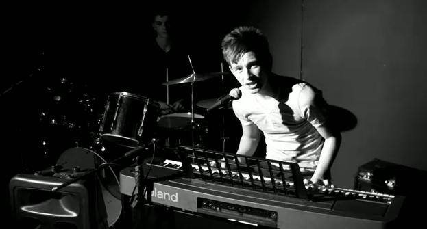
- This early establishing shot means that the audience can quite clearly see the main voice ( the lead singer ) is most definitely present. However there are certain shots in which we can hear the artists voice and therefore tell it is him who is singing , but can see a different couple , in which the lyrics have a strong link to. This could be seen as being both present, and absent.

- The evident link between the lyrics and video is on that is obvious in terms of that the lead singer is talking about the characters included, however the clear reason and problem certainly creates a narrative fuzz. This slight vagueness, allows not only for people watching to remain engaged as they try and figure out the plot further, but also will allow any watching to put themselves in the position of either the character or lead singer, this first person mode of address is enhanced with plenty of meat shots and the lead singer looking into the camera.
- In order to convey the problem in what is clearly a relationship between the two characters we had to initiate a clear contrast between a memory that appeared to be happy, and those that showed emotion, for the worse. For the majority of our ''happy shots'' we used an effect which showed a a high contrast in the colour red. The colour has stereotypically got connotation of love as in a heart, which showed the relationship and when put together with a shot with plenty of movement, proved to work well. However equally red also has connotations with anger, and frustrations, we felt this was a clever way to convey both emotions in one, and leave it up to interpretation of the audience to decide what emotion was going through the characters heads at that specific time.

- On the flip side, when we wanted to show a clear time of when the characters seemed upset or feeling sorry for themself we using a grainier wash , with little bright colours, we felt this best described and showed connotations of a broken couple or relationship.

- This shows little colour and only one side of the characters face. She is looking away from the camera suggesting she is deep in thought, which when placed in with the lyrics, we can only assume is about the relationship .
- The lyrics of the song 'walk away' suggest a male telling a female to 'walk away' from him as he is bad for her. Yet she cannot. This suggest that the male is in control of the relationship and that the women cannot see past her feelings for him, this conforms to the stereotype that men and predominately superior in relationships , in todays patriotic society.

- Here shows a shot of the male character walking away from the girl, yet she chases after him. The fact that this is such a common problem in todays society which is shown on TV drama's films, and even in real day to day life, means it's social currency is increased . People can talk about the video , comparing it to things they have personally seen, watched or even experienced
.Goodwin's Framework;
Goodwins critical framework is something we considered upon constructing our music video, we used a strong link towards the lyrics and video. However despite the link between the lyrics and video, we avoided a ''story telling'' type approach , we wanted to leave a lot down to interpretation.

At this point the lead singer sings; '' Fallen in love in the worst way'' it then cuts to a POV shot of the female character laughing and clearly happy. However the amplification the colour red could suggest a deeper meaning of a problem she is not showing. And how her obsession with the male character is eventually her downfall. This complies with the stereotype that women are often the obsessive ones in relationships.

Jcutts - Question 3
How did the audience feedback inform your concept development?
In order to plan our shoots we used our audience research to decide what would be best . Using survey monkey we were able to gather our research back easily and then make decisions in correlation to the responses.

- Here shows that the people who answered suggested that two to four different locations would be most preferred followed by five or more. This was as expected as we intended on using many different locations but with a similar style to keep to a relatively clear narrative which the audience also indicated they wanted. However doing this we had to enable we kept some narrative fuzz.
- We asked the question what do they think the song is about , to give us an idea of what the audience would expect the forms and conventions to be of it , as you would do in real life when a song is released before the video.
- 'Oh this song is extremely sad and happy. I would personally class it as powerful. It is a moving piece and really sets off ones emotions. Good choice.'
- This was the general idea we got , a lot of people where not sure of the song but gathered it was a relationship that had ups and downs. We used this information and thought that if we left our music video open ended it would give the same confusion that the song gave and not make anything to obvious. This also would allow the audience the ability to put themselves in the position with the band or characters showing a first person mode of address, as if these words and video is meant for a particular person.

- What the lead singer and band should wear was something that we strongly considered before shoots. We had to consider Dyer's paradox's in the sense of a star must be extraordinary and ordinary . This meant we wanted the star to look stylish and in with the genre, but also ordinary looking enough for people to be able to feel like they have some comparison to the lead singer/ band. We decided to dress the lead singer in skinny jeans a white top and a leather jacket in the urban locations and in the band shots, jeans again with a tight Grey top .
- This also had to be taken into consideration when thinking about what the characters would be wearing . We decided on a ordinary look again with the female character wearing leggings a leather jacket and a top. As for the male we gave him a Jacket and Jeans. We felt dressing as any other person would show how relevant the song can be to almost anyone .
George - Evidence of call sheets/ risk asessments
Here is evidence of our call sheets and risk assessments whilst going out on a shoot with school equipment:


James - Evaluation Question 3
How did the audience feedback inform your concept development?
Our audience feedback suggested that we should have a narrative running through our video. Below is an example of the feedback that we received from asking the question "Do you prefer music videos that have a clear story within them or ones that have no relevance to the lyrics of the song?"
We also wanted to see where the target audience thought our video should be filmed, 53% of the audience said that they thought it should be filmed in the city. They also said that it would be better if there was several different locations within the city. We took this advice on board and when we were in London filming and found different locations for both the narrative and the performance parts of the video
we also asked the target audience "In performance shots how do you think the lead singer should be dressed?" and we got some very helpful responses such as:
Our audience feedback suggested that we should have a narrative running through our video. Below is an example of the feedback that we received from asking the question "Do you prefer music videos that have a clear story within them or ones that have no relevance to the lyrics of the song?"
- I think it is always lovely to see music videos where you can see a relationship between the visuals and the lyrics. Otherwise it makes no sense and i get so confused. There is no point in having visuals that do not even fit with the song you are attempting to accompany. Overall, i think that the lyrics should mostly link with the visuals. This would be extremely effective and create a good quality piece.
We also wanted to see where the target audience thought our video should be filmed, 53% of the audience said that they thought it should be filmed in the city. They also said that it would be better if there was several different locations within the city. We took this advice on board and when we were in London filming and found different locations for both the narrative and the performance parts of the video
we also asked the target audience "In performance shots how do you think the lead singer should be dressed?" and we got some very helpful responses such as:
- The lead singer should be dressed appropriately. I think that a smart look really adds a sense of sophistication, not only to the artist, but to the piece as a whole. It targets a well accomplished audience and creates a quality piece. However, you could make women look more appealing, yet still elegant. Possibly a knee length dress, obviously with black tights and a high neck line. She should not be an object of men's desires.
- Skinny jeans, leather jacket, white t-shirt with design on it underneath.
Tuesday, 4 January 2011
JCutts - Q4
How did you use media technologies in the construction and research, planning and evaluation stages?
We shot out footage on a Sanyo Xacti High Definition Dual Camera. These new HD cameras that had been purchased by the school, made filming and editing more enjoyable as well as giving us a great , smooth music video. However they were slightly different to cameras we had all previosuly used , so we went on a recci to Brighton not only to get shot idea's but also to all familise ourselves with the new HD camera.
We also had to look into what frames per second (FPS) we wanted to set. We decided at some point in our video we would use slow motion which meant we would need to change the settings at some point. We originally used a 60FPS setting, this proved problematic and caused premiere to constantly crash. This resulted in us having an extended deadline due to constant technical problems. Despite this causing frustration amongst the group, we managed to get round it ... eventually.
When editing our slow motion clips we realised that because there would have to a cut in the size of image , it would leave a black curtain each side of the image. To cover this up we inserted a layer over the top of the lead singer.

Here is evidence of where George has posted a video and told us the points we should consider. Further down showed a comment in which we have reflected our idea's on the post. Blogger also allowed us to respond to a video with another video .

Blogger;
We posted all of our posts onto blogger, and used this to post idea's and general conversations including lesson write ups . This allowed us to comment on each others idea's and speak from the convenience of our own homes. It also allowed teachers to look at our progress as well as other members to help out with suggestions and provide advice to how to get round problems we all had come across.
 Here you can see evidence of another class member commenting on one of our posts. This was considered when gathering our audience research .
- Another great feature blogger allowed us to do was to post videos from youtube that we wanted to help show a point found in another music video. This is also allowed us to show evidence of how we gathered research and our development of ideas .

Here is evidence of where George has posted a video and told us the points we should consider. Further down showed a comment in which we have reflected our idea's on the post. Blogger also allowed us to respond to a video with another video .
Survey Monkey;
- The majority of our audience research was done on 'Survey Monkey' , this allowed us to make an online survey . This not only was more accessible as we did not need to print off copy's and give out it could be done through social networks such as facebook, simply by posting the link. Furthermore the data could be put into graphs so it was clear to us what the audience has told us on each question.

- This shows our survey on the data collection tab, this enabled us to see the breakdown of each answer clearly.
Adobe Premier Elements;
- We used this programme to edit our footage in , with the experience of using the previous programme last year we had a basic knowledge of how to use it. The newer programme had a slightly different layout and a few more effects but other than that were only a matter of time to get to used to .
- We discussed what effect we were going to include in our music video in order to show off what we were capable of , without it looking out of place in our music video. One of out more successful effect was the '' photo shot'' This include us taking a photo and dropping it , as it hit the ground we pinned a piece of footage on premier and allowed it to play, so it gave the effect that the photo was actually in fact moving.

Another effect we used was for the final shot which was shot in slow motion, in order for us to cover up for the fact the initial image is infact smaller. This is due to the setting change on the camera in order to shoot in slow motion . We had to layer our lead singer over the top , not only did this help to make it more smooth, it ended with the lead singers face, which gives good , obvious band image, branding the artist and band with the music.

Thursday, 23 December 2010
James - Evaluation Question 4
How did you use media technologies in the construction and research, planning and evaluation stages?
Cameras
We shot all of our footage on the Sanyo Xacti High Definition Dual Camera. These cameras had just been purchased by the schools Media Studies department and therefore we were not familiar with them at the start of shooting. However we soon learnt how to make best use of them and the quality of picture that they filmed was incredible. When we created our AS coursework we were using older cameras that weren’t HD and recorded onto tape, therefore these cameras were a great and welcome improvement.

We did however have some problems with the new camera. Firstly it was recording 60fps in HD, which proved too much information for Premiere (our editing software) to handle. This caused Premeier to crash constantly throughout our editing process; this problem became so bad that our group had to have the final deadline extended because we didn’t have enough time to complete our edit.
Another problem was had was shooting in slow motion. When a camera films something in slow motion it has to take in much more information then when it is shooting in normal time. To compensate for all of this extra data that it is taking in it reduces the frame size and to use the slow motion footage we then have to resize the frame. This causes its quality to greatly decrease and the image becomes very grainy so we tried to overlay other footage on top so that this was not as noticeable. An example of this can be seen below:
 |
| We overlaid Jamie singing to the slow motion shot of us walking. This made the loss of quality less noticeable. |
I think that the best thing about the new cameras was then when we put them on manual focus we were able to show depth of field. This effect where the foreground is in focus and the background is out of focus looks very professional and is extremely common in music videos. We would not have been able to create this effect if we had still been using the old cameras. Below is an example of when we used this effect in our music video and also an example of one of JLS’s videos where they use the same effect.
 |
| This is one of the shots in which we used 'depth of field'. |
 |
| This is an example of 'depth of field' used in JLS - Love You More |
Pages ‘08
“Pages ’08” is the software I used to create my digipak and advertisement. The reason I used this software rather than Photoshop is because I have an Apple iMac at home at Pages ’08 comes with it. I am very familiar with this software and so found it very easy to use.
To create my digipak I opened a blank A3 document and within it I made 4 squares that measured 12.7cm in width and height. These were the basic 4 panels of the digipak. I knew that I wanted to have quite a ‘dirty’ and ‘urban’ background to my digipak and so I found a close up image of a hessian bag on the Internet and decided it would be suitable. Below is step by step instructions of how i created the two key images for my digipak.
 |
| Click to enlarge |
After I had created the background and made the alien image ready to use all I had to do was select a font and choose a layout. The font I used was called ‘Fenwick’ and I downloaded it off of ‘dafont.com’. This is another example of how Web 2.0 greatly increases the possibilities of what I could achieve. I think this font really suits the bands image, as it is strong and bold. I think there was a danger of the font looking too masculine but I managed to overcome this problem by using a neutral white color. Putting the font in white also helped it stand out from the dark background more, this heavily influenced the adverts leading line in particular.
Blogger
We used a blog to document our research, planning, development, and evaluation stages of our coursework. Using a blog is fantastic because it allows all members of our group to be able to post work at any time and from anywhere that has computer access. It also allows other people to comment on our posts such as the teachers and other members of the class. This collaborative function was very useful during all stages of our coursework, an example of such collaboration can be seen below.
 |
| Jamie has commented on some of my work documenting his thoughts and opinions. |
The teachers are also able to mark and comment on our work in the same way. This means that we can very easily submit work and gain feedback even if we are not in school for some reason. An example of this is below:
 |
| Ms Johnson is my Media Studies teacher |
The blog is a website that allows the user to post images and embed video clips. This is very useful when you need to illustrate one of your points or show people the things that are inspiring you. Here is an example of some ideas that Jamie was interested in and decided to put on the blog to see what me and George though of them.
 |
| Jamie included the hyperlink to the different video's YouTube pages. |
Survey Monkey
To gain audience feedback we used a website called surveymonkey.com which provides the software to create a questionnaire. There are several different question types you can choose from such as ‘tick-box’ and ones where the audience has a text field in which to write their own feedback. SurveyMonkey also allows the user to link or email the survey to the target audience. Our group circulated our survey by posting in on the social networking site ‘Facebook’. We thought that this would be the best place to access our target audience because our friends are in the correct age range and also like this genre of music. Here is a screen shot of one of our questionnaires:

Adobe Premier Elements
We used this software to edit our footage because it is more that capable for our needs. The package allowed us to put various effects onto our work as well as doing the basic things like filling a timeline and having different layers of video.
We wanted to distinguish the performance and narrative parts of out video and did this by using the effects that ‘Premiere’ has. We decided that the performance shots looked best in black and white and so simply dragged this effect from the effects menu and dropped it on each performance clip. The narrative shots needed something more unusual however and we tried many different effects before finally settling on one. We used the 'colorize' and removed all blue from the image, whilst also increasing the red content to its maximum. The result of this is shown below:

I think that this makes the narrative shots very striking and the red also connotes that the relationship doesn’t end well.
Premiere also allowed us to speed up footage using the time stretch tool. We used this feature on the traffic shots (see below) as they help to enforce the point that the relationship broke down over a long period of time.

Premiere also allowed us to create a very complex special effect where a photograph, which is thrown to the floor by one of the characters, then starts to become animated and then fades out. To do this we had to get a screen grab of the footage that we wanted to the photograph to be of. Then we had to film the photo falling to the floor, making sure that all if it was in the frame and that it fell perfectly flat. Next we imported the footage onto the computer and overlaid the footage that we wanted the photo merge into and dragged it to the right place and into the right shape.
James - Evaluation Question 2
How effective is the combination of your media and ancillary texts
We were tasked with creating a music video with accompanying digipak and advertisement that effectively creates band image and sells the band, but at the same time is in keeping with the correct genre. In The Scripts case, the genre is an ‘indie boy-band’.
We set out to create a cohesive, appealing band image to promote the album through creating the video and the print work. This meant that the print work and video needed to be in some ways reminiscent of one another. I chose to design an advert that would be positioned in the bottom third of the right-hand page in NME. I think that the advert would be seen more if it was on the right-hand page because as you flick through the pages of a magazine, you see the right-hand page first. I think that the advert should run in NME because it is a well-established music magazine that has a reader circulation of 56,000. This is a great way for the scripts music to get advertised to their target audience.

DIGIPAK AND ADVERT IMAGE
In my digipak and advert (see above) I used the image of an alien that we found grafittied on a wall when we were on our Brighton reccie. I then redrew the alien, changing the shape of its head and adding a necklace, tattoo and giving it shoes.
The alien acts as a visual motif because it is such a striking and visually arresting image. The alien will stay in the mind of anyone who sees the advert and then they will be able to immediately recognize the digipak if they see it in a shop. The use of this visual motif tells the viewer that ‘The Script’ is a slightly abstract band because the image is so unusual. The reason I added the necklace and tattoo to the image is because they connote faith and religion and ‘The Script’s’ album is titled ‘Science and Faith’. We chose to use the alien not only because it is visually arresting but also because it connotes science, and with the added necklace and tattoo the image as a whole connotes both science and faith.
I decided to include a review of the new single at the bottom of the advert to show the audience that the band is highly regarded by critics. I chose to use Greg James because he is a BBC Radio 1 presenter that will be well known by the target audience. This means that his opinion is respected and people are more likely to purchase a product if it has been recommended.
The adverts’ leading line is from the top line of text (THE SCRIPT) then across to the face of the alien and then back across to the second line of text (WALK AWAY). After this your eye falls down to the review and then to the bottom right corner that tells you the single is available on iTunes. I think the reason your eye is firstly drawn to the top line of text is because it is so large and stands out in the centre of the page against the dark background. It is very good that the first thing people see when they look at the advert is the name of the band because then even if they don’t carry on looking at the advert they will have still read the bands name and know what it was about.
The image is anchored to the advert by the text ‘NEW SINGLE’ because the text is very close to the elbow of the alien. This helps create the leading line because the eye goes form the top line of text across to the aliens face and then out of his elbow to this text.
I think that the image and overall design of the digipak is postmodern because neither the front or back cover have images of the band on, and the alien image its self is very thought provoking and could be interpreted in many different ways.
By using the alien across both the digipak and the advert a visual link is created between the print works, using the same font in the same color further strengthens this link. A visual link is needed between the two ancillary texts so that if someone sees the advert and would like to buy the product, they will be able to recognize it in the shop. It is for the same reason that the digipak and video must also have a visual link. This is why I chose to include an image of the band on the inside cover of the digipak. This will help someone who has seen the video to identify the album in a shop.
I did however differentiate the visual link between the digipak and advert slightly. As the advert was just for the single ‘Walk Away’ and the digipak is for the whole album ‘Science and Faith’ I thought that it would be fitting to have the aliens in different colors. If I were to make another digipak just for the ‘Walk Away’ EP then I would use the orange and purple alien on the front cover.
James - Evaluation Question 1
In what ways does your media product use, develop or challenge forms and conventions of real media products?
Our music video and print work both conform and break different conventions of the genre that they are made within. The form of a music video is often made up of visuals that have some link to the lyrics and some type of performance shots. Our work clearly includes both of these aspects and therefore is clearly a music video.
Conforming to Conventions
The video conforms to the conventions of its genre in many ways. After researching into the ‘indie pop’ genre we found that one very common feature in videos of this genre is the presence of band performance shots. It was for this reason we decided to make the majority of our video either as band performance shots or just the lead singer lip-synching in different locations. Performance shots are common in this style of music videos because through first person mode of address the audience feel like they are connecting to the artist in the video and so the ‘fourth wall’ is being broken. To really make this connection meat shots of the artist looking directly into the camera are constantly used. You can see examples of this first person mode of address in our video below:

Shots like theses allow the audience to identify with the artist. They also reinforce Dyers first paradox that stars must be simultaneously ordinary and extraordinary. In this particular shot the singer is looking into the camera making him seem ordinary to the audience, but at the same time the way he has been light and the fact that he is performing in a band makes him extraordinary.
Another way the video conforms to its conventions is by using a narrative to convey the meaning of the song. The narrative links the lyrics to the visuals and helps the audience understand the story that the song is trying to tell. Our videos narrative shows a man and woman who end up having relationship problems; it is typical for videos of this genre to have a narrative that shows a man and woman's relationship. The way that the woman is represented in these videos however is not always the same. In many music videos women are idolised, however this is often with a very strong sexual connotation (the objectification of women). An example of such a representation of women is shown in Ne-Yo’s video ‘Miss Independent’ seen below:
At the start of our video and in the photograph sfx at the end, we see the woman to be very happy in the relationship. However these shots are intertwined throughout the video with ones of the couple arguing and individually looking very sad. As both of the characters are shown looking sad they girl is not represented as being overly emotional or pathetic in any way. This challenges some modern stereotypes that are shown in the media about women.

The preferred reading of these shots is that the woman is very happy and loves her boyfriend, the audience is meant to like her and feel happy for her. However this soon changes as towards the end of the video we see the girl looking very solumn which is meant to represent the relationship getting worse and going wrong. This idea is further shown to the audience as we see similar shots of the male character also looking sad.


The images of the two characters looking sad tell the audience that the relationship is not going well however they do not know why. Towards the end of the video more light is shed on what happened to the couple. We see the woman hand her boyfriend a photo of the two of them looking really happy as if she is trying to make the man realize how happy they could be again. The man doesn't react well to this and walks away with the woman quickly running after him. This reinforces a common stereotype about women that they often get hurt and are reluctant to leave men who end a relationship. This is the image of the man walking away with his ex-girlfriend running after him:

Narrative fuzz is used effectively here because they audience are left guessing what happened to the couple to ruin the relationship. This increases the value of the videos social currency, as it will act as a talking point between members of the target audience, it also makes the text polysemic.
Goodwin’s Critical Framework
Using Goodwin’s critical framework we can see that there are many aspects of our video that are present in hundreds of videos that have come before it from this and other genres.
One such aspect that Goodwin would have pointed out is that there is a strong link between the lyrics of the song and the visuals. This link is either established through lip-syncing or shots such as the one below:
 |
| The lyric whist we see this shot is 'so walk way, walk away' and we can see that the footage reflects that. |
The videos cutting rate also mirrors the songs fast pace during the chorus and slower pace during the lyrics. The fast pace at the chorus could be seen as denoting the fast-paced and hectic lifestyles that the band members have. One observation that Dyer made when writing about stars, was that they are often shown to lead busy and rebellious lifestyles that their fans idolise. You can see a prime example of this fast cutting rate at the start of the first chorus. We made this into a short montage, which cuts every time there is a crash of the symbol. The montage lasts for two seconds between 0:33 and 0:35 but has seven cuts within it, you will be able to find it in the copy of our video below:
Goodwin also suggested that music videos amplify the lyrics of the song in several different ways. We have amplified the lyrics of our song in our music video in the following ways:
- Lyrics have been amplifed my lip syncing throught the video.
- The tune and rhythmn of the song has been amplified by the performance shots.
- Using first person mode of address amplifies some of the lyrics such as the shot where Jamie sings 'I dont know why shes with me' whilst looking directly into the camera. This makes it seem as if Jamie is asking the question to the audience, and so it also breaks the 'fourth wall'.
Subscribe to:
Posts (Atom)