Thursday, 23 December 2010

James - Evaluation Question 4

How did you use media technologies in the construction and research, planning and evaluation stages?

Cameras
We shot all of our footage on the Sanyo Xacti High Definition Dual Camera. These cameras had just been purchased by the schools Media Studies department and therefore we were not familiar with them at the start of shooting. However we soon learnt how to make best use of them and the quality of picture that they filmed was incredible. When we created our AS coursework we were using older cameras that weren’t HD and recorded onto tape, therefore these cameras were a great and welcome improvement.


We did however have some problems with the new camera. Firstly it was recording 60fps in HD, which proved too much information for Premiere (our editing software) to handle. This caused Premeier to crash constantly throughout our editing process; this problem became so bad that our group had to have the final deadline extended because we didn’t have enough time to complete our edit. 

Another problem was had was shooting in slow motion. When a camera films something in slow motion it has to take in much more information then when it is shooting in normal time. To compensate for all of this extra data that it is taking in it reduces the frame size and to use the slow motion footage we then have to resize the frame. This causes its quality to greatly decrease and the image becomes very grainy so we tried to overlay other footage on top so that this was not as noticeable. An example of this can be seen below:

We overlaid Jamie singing to the slow motion shot of us walking. This made the loss of quality less noticeable.


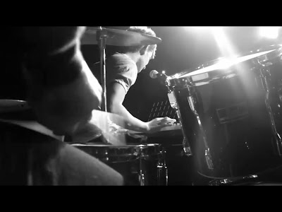
I think that the best thing about the new cameras was then when we put them on manual focus we were able to show depth of field. This effect where the foreground is in focus and the background is out of focus looks very professional and is extremely common in music videos. We would not have been able to create this effect if we had still been using the old cameras. Below is an example of when we used this effect in our music video and also an example of one of JLS’s videos where they use the same effect.

This is one of the shots in which we used 'depth of field'.

This is an example of 'depth of field' used in JLS - Love You More


Pages ‘08
Pages ’08 is the software I used to create my digipak and advertisement. The reason I used this software rather than Photoshop is because I have an Apple iMac at home at Pages ’08 comes with it. I am very familiar with this software and so found it very easy to use. 

To create my digipak I opened a blank A3 document and within it I made 4 squares that measured 12.7cm in width and height. These were the basic 4 panels of the digipak. I knew that I wanted to have quite a ‘dirty’ and ‘urban’ background to my digipak and so I found a close up image of a hessian bag on the Internet and decided it would be suitable. Below is step by step instructions of how i created the two key images for my digipak. 

Click to enlarge


After I had created the background and made the alien image ready to use all I had to do was select a font and choose a layout. The font I used was called ‘Fenwick’ and I downloaded it off of ‘dafont.com. This is another example of how Web 2.0 greatly increases the possibilities of what I could achieve. I think this font really suits the bands image, as it is strong and bold. I think there was a danger of the font looking too masculine but I managed to overcome this problem by using a neutral white color. Putting the font in white also helped it stand out from the dark background more, this heavily influenced the adverts leading line in particular.

Blogger
We used a blog to document our research, planning, development, and evaluation stages of our coursework. Using a blog is fantastic because it allows all members of our group to be able to post work at any time and from anywhere that has computer access. It also allows other people to comment on our posts such as the teachers and other members of the class. This collaborative function was very useful during all stages of our coursework, an example of such collaboration can be seen below.


Jamie has commented on some of my work documenting his thoughts and opinions. 


The teachers are also able to mark and comment on our work in the same way. This means that we can very easily submit work and gain feedback even if we are not in school for some reason. An example of this is below:

Ms Johnson is my Media Studies teacher


The blog is a website that allows the user to post images and embed video clips. This is very useful when you need to illustrate one of your points or show people the things that are inspiring you. Here is an example of some ideas that Jamie was interested in and decided to put on the blog to see what me and George though of them.

Jamie included the hyperlink to the different video's YouTube pages. 


Survey Monkey
To gain audience feedback we used a website called surveymonkey.com which provides the software to create a questionnaire. There are several different question types you can choose from such as ‘tick-box’ and ones where the audience has a text field in which to write their own feedback. SurveyMonkey also allows the user to link or email the survey to the target audience. Our group circulated our survey by posting in on the social networking site ‘Facebook’. We thought that this would be the best place to access our target audience because our friends are in the correct age range and also like this genre of music. Here is a screen shot of one of our questionnaires:


Adobe Premier Elements
We used this software to edit our footage because it is more that capable for our needs. The package allowed us to put various effects onto our work as well as doing the basic things like filling a timeline and having different layers of video.

We wanted to distinguish the performance and narrative parts of out video and did this by using the effects that ‘Premiere’ has. We decided that the performance shots looked best in black and white and so simply dragged this effect from the effects menu and dropped it on each performance clip. The narrative shots needed something more unusual however and we tried many different effects before finally settling on one. We used the 'colorize' and removed all blue from the image, whilst also increasing the red content to its maximum. The result of this is shown below:


I think that this makes the narrative shots very striking and the red also connotes that the relationship doesn’t end well.

Premiere also allowed us to speed up footage using the time stretch tool. We used this feature on the traffic shots (see below) as they help to enforce the point that the relationship broke down over a long period of time.


Premiere also allowed us to create a very complex special effect where a photograph, which is thrown to the floor by one of the characters, then starts to become animated and then fades out. To do this we had to get a screen grab of the footage that we wanted to the photograph to be of. Then we had to film the photo falling to the floor, making sure that all if it was in the frame and that it fell perfectly flat. Next we imported the footage onto the computer and overlaid the footage that we wanted the photo merge into and dragged it to the right place and into the right shape.      
   

James - Evaluation Question 2

How effective is the combination of your media and ancillary texts

We were tasked with creating a music video with accompanying digipak and advertisement that effectively creates band image and sells the band, but at the same time is in keeping with the correct genre. In The Scripts case, the genre is an ‘indie boy-band’.

We set out to create a cohesive, appealing band image to promote the album through creating the video and the print work. This meant that the print work and video needed to be in some ways reminiscent of one another. I chose to design an advert that would be positioned in the bottom third of the right-hand page in NME. I think that the advert would be seen more if it was on the right-hand page because as you flick through the pages of a magazine, you see the right-hand page first. I think that the advert should run in NME because it is a well-established music magazine that has a reader circulation of 56,000. This is a great way for the scripts music to get advertised to their target audience.

DIGIPAK AND ADVERT IMAGE

In my digipak and advert (see above) I used the image of an alien that we found grafittied on a wall when we were on our Brighton reccie. I then redrew the alien, changing the shape of its head and adding a necklace, tattoo and giving it shoes.

The alien acts as a visual motif because it is such a striking and visually arresting image. The alien will stay in the mind of anyone who sees the advert and then they will be able to immediately recognize the digipak if they see it in a shop. The use of this visual motif tells the viewer that ‘The Script’ is a slightly abstract band because the image is so unusual. The reason I added the necklace and tattoo to the image is because they connote faith and religion and ‘The Script’s’ album is titled ‘Science and Faith’. We chose to use the alien not only because it is visually arresting but also because it connotes science, and with the added necklace and tattoo the image as a whole connotes both science and faith.

I decided to include a review of the new single at the bottom of the advert to show the audience that the band is highly regarded by critics. I chose to use Greg James because he is a BBC Radio 1 presenter that will be well known by the target audience. This means that his opinion is respected and people are more likely to purchase a product if it has been recommended.

The adverts’ leading line is from the top line of text (THE SCRIPT) then across to the face of the alien and then back across to the second line of text (WALK AWAY). After this your eye falls down to the review and then to the bottom right corner that tells you the single is available on iTunes. I think the reason your eye is firstly drawn to the top line of text is because it is so large and stands out in the centre of the page against the dark background. It is very good that the first thing people see when they look at the advert is the name of the band because then even if they don’t carry on looking at the advert they will have still read the bands name and know what it was about.

The image is anchored to the advert by the text ‘NEW SINGLE’ because the text is very close to the elbow of the alien. This helps create the leading line because the eye goes form the top line of text across to the aliens face and then out of his elbow to this text.

I think that the image and overall design of the digipak is postmodern because neither the front or back cover have images of the band on, and the alien image its self is very thought provoking and could be interpreted in many different ways.      

By using the alien across both the digipak and the advert a visual link is created between the print works, using the same font in the same color further strengthens this link. A visual link is needed between the two ancillary texts so that if someone sees the advert and would like to buy the product, they will be able to recognize it in the shop. It is for the same reason that the digipak and video must also have a visual link. This is why I chose to include an image of the band on the inside cover of the digipak. This will help someone who has seen the video to identify the album in a shop.

I did however differentiate the visual link between the digipak and advert slightly. As the advert was just for the single ‘Walk Away’ and the digipak is for the whole album ‘Science and Faith’ I thought that it would be fitting to have the aliens in different colors. If I were to make another digipak just for the ‘Walk Away’ EP then I would use the orange and purple alien on the front cover.      

James - Evaluation Question 1

In what ways does your media product use, develop or challenge forms and conventions of real media products?

Our music video and print work both conform and break different conventions of the genre that they are made within. The form of a music video is often made up of visuals that have some link to the lyrics and some type of performance shots. Our work clearly includes both of these aspects and therefore is clearly a music video.

Conforming to Conventions
The video conforms to the conventions of its genre in many ways. After researching into the ‘indie pop’ genre we found that one very common feature in videos of this genre is the presence of band performance shots. It was for this reason we decided to make the majority of our video either as band performance shots or just the lead singer lip-synching in different locations. Performance shots are common in this style of music videos because through first person mode of address the audience feel like they are connecting to the artist in the video and so the ‘fourth wall’ is being broken. To really make this connection meat shots of the artist looking directly into the camera are constantly used. You can see examples of this first person mode of address in our video below:


Shots like theses allow the audience to identify with the artist. They also reinforce Dyers first paradox that stars must be simultaneously ordinary and extraordinary. In this particular shot the singer is looking into the camera making him seem ordinary to the audience, but at the same time the way he has been light and the fact that he is performing in a band makes him extraordinary.

Another way the video conforms to its conventions is by using a narrative to convey the meaning of the song. The narrative links the lyrics to the visuals and helps the audience understand the story that the song is trying to tell. Our videos narrative shows a man and woman who end up having relationship problems; it is typical for videos of this genre to have a narrative that shows a man and woman's relationship. The way that the woman is represented in these videos however is not always the same. In many music videos women are idolised, however this is often with a very strong sexual connotation (the objectification of women). An example of such a representation of women is shown in Ne-Yo’s video ‘Miss Independent’ seen below:


At the start of our video and in the photograph sfx at the end, we see the woman to be very happy in the relationship. However these shots are intertwined throughout the video with ones of the couple arguing and individually looking very sad. As both of the characters are shown looking sad they girl is not represented as being overly emotional or pathetic in any way. This challenges some modern stereotypes that are shown in the media about women.


The preferred reading of these shots is that the woman is very happy and loves her boyfriend, the audience is meant to like her and feel happy for her. However this soon changes as towards the end of the video we see the girl looking very solumn which is meant to represent the relationship getting worse and going wrong. This idea is further shown to the audience as we see similar shots of the male character also looking sad.


The images of the two characters looking sad tell the audience that the relationship is not going well however they do not know why. Towards the end of the video more light is shed on what happened to the couple. We see the woman hand her boyfriend a photo of the two of them looking really happy as if she is trying to make the man realize how happy they could be again. The man doesn't react well to this and walks away with the woman quickly running after him. This reinforces a common stereotype about women that they often get hurt and are reluctant to leave men who end a relationship. This is the image of the man walking away with his ex-girlfriend running after him:


Narrative fuzz is used effectively here because they audience are left guessing what happened to the couple to ruin the relationship. This increases the value of the videos social currency, as it will act as a talking point between members of the target audience, it also makes the text polysemic.


Goodwin’s Critical Framework
Using Goodwin’s critical framework we can see that there are many aspects of our video that are present in hundreds of videos that have come before it from this and other genres.

One such aspect that Goodwin would have pointed out is that there is a strong link between the lyrics of the song and the visuals. This link is either established through lip-syncing or shots such as the one below:

The lyric whist we see this shot is 'so walk way, walk away' and we can see that the footage reflects that.


The videos cutting rate also mirrors the songs fast pace during the chorus and slower pace during the lyrics. The fast pace at the chorus could be seen as denoting the fast-paced and hectic lifestyles that the band members have. One observation that Dyer made when writing about stars, was that they are often shown to lead busy and rebellious lifestyles that their fans idolise. You can see a prime example of this fast cutting rate at the start of the first chorus. We made this into a short montage, which cuts every time there is a crash of the symbol. The montage lasts for two seconds between 0:33 and 0:35 but has seven cuts within it, you will be able to find it in the copy of our video below:


Goodwin also suggested that music videos amplify the lyrics of the song in several different ways. We have amplified the lyrics of our song in our music video in the following ways:
  • Lyrics have been amplifed my lip syncing throught the video.
  • The tune and rhythmn of the song has been amplified by the performance shots.
  • Using first person mode of address amplifies some of the lyrics such as  the shot where Jamie sings 'I dont know why shes with me' whilst looking directly into the camera. This makes it seem as if Jamie is asking the question to the audience, and so it also breaks the 'fourth wall'.

George - Evaluation

1.In what ways does your media product use, develop or challenge forms and conventions of real media products?

In many ways does our video use forms and conventions of real media products.

  • The way in which it is structured is the way in which all modern music videos are and that is from a postmodern perspective.

  • You can judge this through many of the techniques and aspects of the video, for example, the mixing together of several camera angles and possibly experimenting with ones from other videos, the way the lyrics are synched with lead singer, the narrative fuzz created on both the band and characters in our particular video, the edit transitions between shots and how the cuts often correspond to the rhythm of the music.

    Here are some examples from our video:

    A close up of the lead singer lip synching:

    Here we have added the effect of black and white.

An extreme close up in/out of focus shot of the keyboard designed to create enigma and depth of field:


A mid shot of the narrative couple with a colourise effect on it:


A low angle close up of drumming with a mid shot of singer in background:


A mid shot of band but in slow motion:


  • All of the performance shots in the studio are in black and white which also draws from other areas.

  • Moreover the different techniques and i think new shots we've tried all conform to a typical postmodern video.
  • The Genre of our video is Alternative pop/rock therefore it was important to follow conventions typical of this genre as after all the purpose of a music video is as a promotional item.

  • Therefore we had to spark interest in our target audience who would be teens/ young adults.

  • In order to do this we had to draw in on things such as costume motifs, the band have to be stylish in order to attract the target audience, which is something we found out in our research, therefore we made sure the band looked the part, so to speak, in fashionable clothes.

  • Another aspect we found from our initial audience research was that a large urban city would be a good place to situate the video therefore we chose London as this holds many iconic places and buildings which 'The Script' often like to be, for example Big Ben here:


  • One theorist we have come across is Goodwin who can help us to explain our videos in greater detail. One aspect he covered was the relationship between visuals and lyrics and visuals and music.

  • In our video this meant making sure the lyrics were synched, making the cutting rate in rhythm with the music and also the narrative parts of the song hold some meaning with the lyrics.

  • Goodwin also talks about the generic conventions of a music video. With this we can talk about how our video is illustrative in its structure and shows a clear image and narrative of the music video and makes sense througout which i think our video conforms to mainly.

  • However there are also some elements of an amplified structure whereby its creative and creates the narrative fuzz that in turn makes an enigmatic audience and serves the purpose of a promotinal item, we used this through the effects on the narrative and also effects and trasitions on filler shots as seen in screenshots above.

  • A final thing Goodwin talked of was first person mode of address where the audience are directly registered by the star or band or narrative people and this creates a more personal feel to it, another promotional tool. We have used this through the meat shots and close ups of the lead singer looking directly in to the camera as seen above also.

    2.How effective is the combination of your main product and ancillary texts?

  • I think the way in which i styled my advert (which can be seen above) is something which conforms to 'The Script' style as something that is postmodern which draws from many other areas such as the intertextual reference of Warhol and his famous pop art pictures.

  • By doing this i thought it would serve well the main purpose of my advert which is to advertise, i chose a full page advert in Q magazine and by creating something bright that you can reference to as something stylish and artistic through Warhol the audiences attention will be drawn to it and thus create the enigma towards the album and hopefully a purchase.

  • Moreover by being considered as something stylish this leads you to something that can be used as a kind of a social currency which can be used to create conversation with people and show what kind of person you are through indexical codes of the bands image.

  • In terms of star persona you can analyse my advert using Dyer.

  • In order to do this you have to follow two paradox's that he explains. Paradox 1 is the notion of the band being present and absent.

  • In my text the band is considered very much absent yet the alien image helps to construct an idea of what they are like as quite stylish and 'kooky' and original which will create an enigma around them that the audience will wish to solve and therefore consume more such as a music video or the album itself yet there will always be a sense of unfulfillment which is why this is a useful advertising strategy.

  • The second paradox is the notion of being ordinary and extraordinary, once again my advert follows the more obscure strategy of being exrtraordinary by mixing a popular art style with something as odd as an alien to represent yourself is something which would be considered as extraordinary which makes 'The Script' stand out from the crowd and make people want to consume more of there media.

  • In terms of ordinary i think the bold stand out white writing covers this as it is not too eratic and gets the point across clearly which overall is what you are trying to do with an advert.

  • The use of these two things help to push the audience to strive to consume more to fill that gap of unknown about the band, however the music video itself has used these tactics through fast cuts, close ups and narrative fuzz and therefore create a constant thirst for the band which is exactly what they, the band, want

3.What have you learned from your audience feedback?

  • From our rough cut here were the results when asking a group of 10 peopl

  • when asked what to improve 80% said a faster cutting rate was needed.
  • 100% said more narrative needed to be shown

  • 30% said an effect on the narrative was needed

  • 100% agreed and liked the black and white performance shots

  • 10% said that more fillers were needed

  • 70% said the performance itself should be a bit stronger

  • 20% liked the camera shots and angles we had used so far

  • 50% said that more locations were needed
  • From this secondary research we had established that our performance shots were up to standards. However there was a definite need for a re shoot up in London for the performance and the narrative in order to fill large gaps we had and make the cutting rate faster. At this stage we had grasped the basic aspects collected from the first audience research but had learnt we needed to apply a lot more footage to our sequence and technicalities.
  • The way i conducted this was to take notes ina class and audience discussion which is why i have just written it up here rather than scanning in the paper as computer text is mor legible.

    4. How did you use media technologies in the construction and research, planning and evaluation stages?
  • for our initial research we used a programme called survey monkey here is a link to our survey:
  • http://www.facebook.com/l.php?u=http%3A%2F%2Fwww.surveymonkey.com%2Fs%2FDWVS2DR&h=78d46
  • Here is a screenshot of an example of one of our surveys:

  • to publicise our survey we posted the link onto the social networking site facebook and asked as many people to complete it as possible. Setting up the survey was an easy step by step process and we just used our initiative to publicise and retrieve results.

  • For our pitch we used microsoft powerpoint, a copy of this can be seen further down on our blog, to get the slides onto our blog we also used a programme called slideboom which was just a case of following instructions on the webpage to embed the slides.
  • Throughout our whole coursework time we have been using blogger to document our planning, research and evaluation, in order to conform to blog use conventions we have tried to regularly comment on each others posts and used stills and embeded files in order show uses of I.T and present ourselves clearly throughout.

    here is an example of our blog which has also been designed to fit in with the style of 'The Script'.
  1. At point one in the above image this is where you would edit and add comments to the blog which is something we needed to do in order to conform to the conventions of a blog.
  2. At point two this shows how we would insert images into the blog in order to show use of i.t and help to explain our point in greater detail.

    To create my advert i used the programme Adobe Photoshop here is a screenshot:
  1. At the highlighted point one this shows how I edited much of the picture by using the adjust hue and saturation button, i used this in order to create the right brightness in contrast with colour for my advert as the preset colours were just too bright and took focus away from the text and other important information.
  2. At highlighted point two shows where i created several layers in order to edit the seperate points without the images conflicting with each other so if i made a mistake the whole image would not have to be altered.
  • The lowest layer consists of the four background colours and dividers and works its way up until its just the text on top.

  • The background writing of 'Science and Faith' repeated has a lower opacity so this does not conflict with the main writing but creates more depth and interest to the advert.
  • With the main texts i made sure they were lined up with the 'Science and Faith' background so that it did not distort each other and become hard to read.

  • The text i used had to be downloaded from a website as we all agreed this was the most suitable for the script and all of our print work it is called 'Fenwick'.
    • Throughout the production of my advert i had to be confident with most of the tools on the side panel these included: the magic wand, fill tool, the cropping tool, paintbrush, smudge and blur, text tool, grab tool and resize tool.
    • For the production of our actual video we used a programme called Premier Elements 4, here is a screenshot:


    1. At point one is the organise tab this is where the clips from the camera are stored and where you drag them onto the timeline.

    2. Point two is the edit tab which is where you would edit your effects on the clips and transitions between clips.

    3. Point three where the shortest arrow points is where the opacity bar is and where you set keyframes which i have mentioned later on. The longer arrow shows how you would place the keyframes onto the bar once the clip is highlighted to create fades and merges on top of other clips.

    4. Point four is the cutting tool which i mention later on.

    5. Point five is where the clips are stored as the organize tab is currently selected.

      This screenshot helps to explain the effects tab.


    1. Point one in this screenshot shows where you could adjust the effects you have added in this case with colourize is where you would adjust the blue and red strength in the image.

    2. Point two is where you would select to find transitions the main one we used was cross dissolve.

    3. Highlighted point three is where image control and motion can be altered to change the brightness, positioning, contrast, hue and saturation.
    • In the editing options in the large right column, here is where you would edit the effects we put in, for example with our colourize effect you could adjust the blue and red levels, for ours we made sure the red was dominant over the blue and this is why on some of our filler and narrative shots there is a clear red look to it, also with this tool we adjust hue, saturation and contrast on some fillers to make certain things stand out like the red bus in our time lapsed traffic shots.
    • An important tool within elements was the cutting tool which is located in the bottom right of the viewing window as a small pair of scissors, here is where we would cut the clips to the length we wanted which is very important when trying to get the lip synching right and if you wanted to extend a clip you could always drag it back when hovering over the end of the clip on the timeline.
    • Within elements we encountered many problems with it constantly crashing and often losing work even after saving after everything we do, this i felt inhibited our progression and morale at points, yet we overcame this by being determined to finish to a good standard.
    • As mentioned another effect we used was a time lapse where we sped up a shot into fast motion, a typical postmodern aspect, here you just right click on the clip select time lapse and drag down the counter to how long you want the clip to be.
    • To get the media into our project we had to first export the files off the camera onto a drive on the computer, then we would drag the files into the project box under the blue organise tab at the top right.
    • Another effect we had to use a lot was transitions from one shot to another this could also be located under the effects tab, here we commonly used cross dissolve as this was most effective for our song.
    • Another way in which we used technology was to set markers along a clip in order to fade it in or out at certain points and also lower the opacity on some clips so they could play over one another at the same time, to do this you seleceted the clip and set markers for where you wanted and alter them up or down along the thin yellow strip to determine the opacity.
    • Overall we were already confident on editing software from last year so this enabled us to refine our skills and diplay them in our videos this year to great effect i feel.

    Saturday, 18 December 2010

    James - Final Draft Advertisement

    This is the final version of my promotional advert. I think that it is very visually arresting because the image combines well with the background and the 'stand-out' white text.

    Thursday, 16 December 2010

    Group - Video Final Cut


    We are really pleased with how our final cut has ended up. We had to overcome numerous problems during our edit including a faulty computer and corrupt footage, but we mageged to continue and we think the finished video is of a high standard.

    Friday, 10 December 2010

    Audience Feedback Questions

    1. How appropriate is this video for this track?
    2. Explain what you think is happening in the narrative of the video.
    3. How do you think band image is constructed?
    4. What are your opinions about the performance shots?
    5. Were do you think the video is weakest, why?
    6. Where do you think the video is strongest, why?

    Thursday, 9 December 2010

    George - Final Advert

    Below is my finished full page advert for The Script and their album:


    Here i have made all the changes i previously mentioned. I have also added 'Science and Faith' repeated in the background to give the piece more depth. I changed the font to 'Fenwick' so it matches the digipak. The hallmark and copywrite writing is all there and the aliens smaller.

    Monday, 6 December 2010

    George - First draft advert

    Here is a first draft of our advert:


    Obviously we decided to use the intertextual reference of Warhol and his famous pop art pictures which i think will definately catch the eye of the readers.

    Being a first draft there were a few problems with this i hope to amend. These are the exclamation mark, it was considered 'Tacky' especially to the type of audience we wish to attract. Another pronblem was the writing at the bottom was too large and needed to be made much smaller. Hallmarks of sonymusic and copywrite information need to be added in at the bottom in the smallprint. Finally the alien needs to be made smaller so the text doesnt conflict with it sao much.

    Other than these simple alterations everyone in our group was happy with the design and feel it fits 'The Scripts' image whilst corresponding with the digipak.

    Thursday, 2 December 2010

    James - Change to the digipak image

    We were told that we were not allowed to use the photo that we took of the alien because it was not completely our own image. To get around this I have redrawn the alien and changed the shape of its head amongst other things.

    Original Alien
    We took this image whilst we were on our Brighton reccie, it was on a wall and part of a much bigger piece of graffiti. The teachers however feel that even though there is not copyright on the image, we have not created it and so we cant use it. For this reason I decided to modify the image as shown below.


    Hand Drawn Alien


    The main change I made to the image was to change the shape of the aliens head. I thought that the shape of the head was the most distinctive feature and so if i changed it we would definitely be able to use the image for our print work. I have also added a tattoo and necklace to the alien which both connote 'faith'. The necklace has a cross on the end of it, and the tattoo on the aliens forearm is the symbol for a church used on OS Maps. When I scanned the image into the computer and enlarged it I felt that the colours were not strong enough. To resolve this I changed some of the settings, the final result is below.


    Computer Edited Final Image
    By raising the hue level to its highest and lowing the saturation slightly the orange colour has changed to yellow. I feel this makes the image much stronger and the yellow is much less blotchy than the orange was previously. This is the image I am going to use on the front of  my digipak and it will also feature in my advert.

    George - production update

    This week has been somewhat of a problem for everyone as due to the snow we have nor been able to go to school and this means we have not been able to continue with editing.

    However we feel that with this extension of the deadline we will comfortably finish the production side of things. For now we will progress with as much of the evaluation as possible.