
1.In what ways does your media product use, develop or challenge forms and conventions of real media products?
In many ways does our video use forms and conventions of real media products.
- The way in which it is structured is the way in which all modern music videos are and that is from a postmodern perspective.
- You can judge this through many of the techniques and aspects of the video, for example, the mixing together of several camera angles and possibly experimenting with ones from other videos, the way the lyrics are synched with lead singer, the narrative fuzz created on both the band and characters in our particular video, the edit transitions between shots and how the cuts often correspond to the rhythm of the music.
Here are some examples from our video:
A close up of the lead singer lip synching:
Here we have added the effect of black and white.

An extreme close up in/out of focus shot of the keyboard designed to create enigma and depth of field:

A mid shot of the narrative couple with a colourise effect on it:

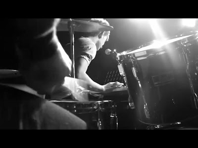
A low angle close up of drumming with a mid shot of singer in background:
A mid shot of band but in slow motion:

- All of the performance shots in the studio are in black and white which also draws from other areas.
- Moreover the different techniques and i think new shots we've tried all conform to a typical postmodern video.
- The Genre of our video is Alternative pop/rock therefore it was important to follow conventions typical of this genre as after all the purpose of a music video is as a promotional item.
- Therefore we had to spark interest in our target audience who would be teens/ young adults.
- In order to do this we had to draw in on things such as costume motifs, the band have to be stylish in order to attract the target audience, which is something we found out in our research, therefore we made sure the band looked the part, so to speak, in fashionable clothes.
- Another aspect we found from our initial audience research was that a large urban city would be a good place to situate the video therefore we chose London as this holds many iconic places and buildings which 'The Script' often like to be, for example Big Ben here:

- One theorist we have come across is Goodwin who can help us to explain our videos in greater detail. One aspect he covered was the relationship between visuals and lyrics and visuals and music.
- In our video this meant making sure the lyrics were synched, making the cutting rate in rhythm with the music and also the narrative parts of the song hold some meaning with the lyrics.
- Goodwin also talks about the generic conventions of a music video. With this we can talk about how our video is illustrative in its structure and shows a clear image and narrative of the music video and makes sense througout which i think our video conforms to mainly.
- However there are also some elements of an amplified structure whereby its creative and creates the narrative fuzz that in turn makes an enigmatic audience and serves the purpose of a promotinal item, we used this through the effects on the narrative and also effects and trasitions on filler shots as seen in screenshots above.
- A final thing Goodwin talked of was first person mode of address where the audience are directly registered by the star or band or narrative people and this creates a more personal feel to it, another promotional tool. We have used this through the meat shots and close ups of the lead singer looking directly in to the camera as seen above also.
2.How effective is the combination of your main product and ancillary texts?
- I think the way in which i styled my advert (which can be seen above) is something which conforms to 'The Script' style as something that is postmodern which draws from many other areas such as the intertextual reference of Warhol and his famous pop art pictures.
- By doing this i thought it would serve well the main purpose of my advert which is to advertise, i chose a full page advert in Q magazine and by creating something bright that you can reference to as something stylish and artistic through Warhol the audiences attention will be drawn to it and thus create the enigma towards the album and hopefully a purchase.
- Moreover by being considered as something stylish this leads you to something that can be used as a kind of a social currency which can be used to create conversation with people and show what kind of person you are through indexical codes of the bands image.
- In terms of star persona you can analyse my advert using Dyer.
- In order to do this you have to follow two paradox's that he explains. Paradox 1 is the notion of the band being present and absent.
- In my text the band is considered very much absent yet the alien image helps to construct an idea of what they are like as quite stylish and 'kooky' and original which will create an enigma around them that the audience will wish to solve and therefore consume more such as a music video or the album itself yet there will always be a sense of unfulfillment which is why this is a useful advertising strategy.
- The second paradox is the notion of being ordinary and extraordinary, once again my advert follows the more obscure strategy of being exrtraordinary by mixing a popular art style with something as odd as an alien to represent yourself is something which would be considered as extraordinary which makes 'The Script' stand out from the crowd and make people want to consume more of there media.
- In terms of ordinary i think the bold stand out white writing covers this as it is not too eratic and gets the point across clearly which overall is what you are trying to do with an advert.
- The use of these two things help to push the audience to strive to consume more to fill that gap of unknown about the band, however the music video itself has used these tactics through fast cuts, close ups and narrative fuzz and therefore create a constant thirst for the band which is exactly what they, the band, want

3.What have you learned from your audience feedback?
- From our rough cut here were the results when asking a group of 10 peopl
- when asked what to improve 80% said a faster cutting rate was needed.
- 100% said more narrative needed to be shown
- 30% said an effect on the narrative was needed
- 100% agreed and liked the black and white performance shots
- 10% said that more fillers were needed
- 70% said the performance itself should be a bit stronger
- 20% liked the camera shots and angles we had used so far
- 50% said that more locations were needed
- From this secondary research we had established that our performance shots were up to standards. However there was a definite need for a re shoot up in London for the performance and the narrative in order to fill large gaps we had and make the cutting rate faster. At this stage we had grasped the basic aspects collected from the first audience research but had learnt we needed to apply a lot more footage to our sequence and technicalities.
- The way i conducted this was to take notes ina class and audience discussion which is why i have just written it up here rather than scanning in the paper as computer text is mor legible.
4. How did you use media technologies in the construction and research, planning and evaluation stages? - for our initial research we used a programme called survey monkey here is a link to our survey:
- http://www.facebook.com/l.php?u=http%3A%2F%2Fwww.surveymonkey.com%2Fs%2FDWVS2DR&h=78d46
- Here is a screenshot of an example of one of our surveys:

- to publicise our survey we posted the link onto the social networking site facebook and asked as many people to complete it as possible. Setting up the survey was an easy step by step process and we just used our initiative to publicise and retrieve results.
- For our pitch we used microsoft powerpoint, a copy of this can be seen further down on our blog, to get the slides onto our blog we also used a programme called slideboom which was just a case of following instructions on the webpage to embed the slides.
- Throughout our whole coursework time we have been using blogger to document our planning, research and evaluation, in order to conform to blog use conventions we have tried to regularly comment on each others posts and used stills and embeded files in order show uses of I.T and present ourselves clearly throughout.
here is an example of our blog which has also been designed to fit in with the style of 'The Script'.

- At point one in the above image this is where you would edit and add comments to the blog which is something we needed to do in order to conform to the conventions of a blog.
- At point two this shows how we would insert images into the blog in order to show use of i.t and help to explain our point in greater detail.
To create my advert i used the programme Adobe Photoshop here is a screenshot:

- At the highlighted point one this shows how I edited much of the picture by using the adjust hue and saturation button, i used this in order to create the right brightness in contrast with colour for my advert as the preset colours were just too bright and took focus away from the text and other important information.
- At highlighted point two shows where i created several layers in order to edit the seperate points without the images conflicting with each other so if i made a mistake the whole image would not have to be altered.
- Throughout the production of my advert i had to be confident with most of the tools on the side panel these included: the magic wand, fill tool, the cropping tool, paintbrush, smudge and blur, text tool, grab tool and resize tool.
- For the production of our actual video we used a programme called Premier Elements 4, here is a screenshot:

- At point one is the organise tab this is where the clips from the camera are stored and where you drag them onto the timeline.
- Point two is the edit tab which is where you would edit your effects on the clips and transitions between clips.
- Point three where the shortest arrow points is where the opacity bar is and where you set keyframes which i have mentioned later on. The longer arrow shows how you would place the keyframes onto the bar once the clip is highlighted to create fades and merges on top of other clips.
- Point four is the cutting tool which i mention later on.
- Point five is where the clips are stored as the organize tab is currently selected.

This screenshot helps to explain the effects tab.

- Point one in this screenshot shows where you could adjust the effects you have added in this case with colourize is where you would adjust the blue and red strength in the image.
- Point two is where you would select to find transitions the main one we used was cross dissolve.
- Highlighted point three is where image control and motion can be altered to change the brightness, positioning, contrast, hue and saturation.
- In the editing options in the large right column, here is where you would edit the effects we put in, for example with our colourize effect you could adjust the blue and red levels, for ours we made sure the red was dominant over the blue and this is why on some of our filler and narrative shots there is a clear red look to it, also with this tool we adjust hue, saturation and contrast on some fillers to make certain things stand out like the red bus in our time lapsed traffic shots.
- An important tool within elements was the cutting tool which is located in the bottom right of the viewing window as a small pair of scissors, here is where we would cut the clips to the length we wanted which is very important when trying to get the lip synching right and if you wanted to extend a clip you could always drag it back when hovering over the end of the clip on the timeline.
- Within elements we encountered many problems with it constantly crashing and often losing work even after saving after everything we do, this i felt inhibited our progression and morale at points, yet we overcame this by being determined to finish to a good standard.
- As mentioned another effect we used was a time lapse where we sped up a shot into fast motion, a typical postmodern aspect, here you just right click on the clip select time lapse and drag down the counter to how long you want the clip to be.
- To get the media into our project we had to first export the files off the camera onto a drive on the computer, then we would drag the files into the project box under the blue organise tab at the top right.
- Another effect we had to use a lot was transitions from one shot to another this could also be located under the effects tab, here we commonly used cross dissolve as this was most effective for our song.
- Another way in which we used technology was to set markers along a clip in order to fade it in or out at certain points and also lower the opacity on some clips so they could play over one another at the same time, to do this you seleceted the clip and set markers for where you wanted and alter them up or down along the thin yellow strip to determine the opacity.
- Overall we were already confident on editing software from last year so this enabled us to refine our skills and diplay them in our videos this year to great effect i feel.
No comments:
Post a Comment