- Use artificail lighting for an inside location
- Use HD cameras to achieve technical excellence durign the filming of performance and narrative

Thursday, 21 October 2010
Group - Test Shots In The Drama Studio
Today we are going to experiment with lighing in the drama studio. Our two main objectives are to learn how to:
Wednesday, 20 October 2010
Feedback #3
Excellent – some very promising ideas here and the examples you give provide technical ideas and something to work towards; I particularly liked the shot from Daughty where lead singer is lit in white and other band members in blue – talk to Mr Fiveash about this
The piano shots are useful – although notice that it does cut from MCU to MS which reveals his hands playing some chords – something you will need to consider.
I’m not so keen on the Deuces video, however I can see that the use of BW contrasts, shadows provides some very useful visual pointers to consider.
Hmm – I think you either go for the recording studio feel OR the dark drama studio, not both. The only problem is that there is no lighting in our school one and it is very white…
Well done Jamie.
Tuesday, 19 October 2010
Ideas... JCutts
Heres a few music video's worth looking at , we should defiantly look to incorporate some of these shots in our video;
- Daughtry - September... http://www.youtube.com/watch?v=CvYJQv8EZHY&ob=av2n This video shows some good lighting techniques, particulaly on band shots. They also use some clever shots we could use like s hot from behind the band , it looks very effective.
- Bruno Mars- Just the way you are... http://www.youtube.com/watch?v=LjhCEhWiKXk&ob=av2e This is worth looking at the whole video , some very clever special effective we could use , really well made. Pay attention at the piano shots, as we did speak about getting a piano involved for some of our shots of the lead singer.
- Chris Brown - Deuces... http://www.youtube.com/watch?v=v7jfxBHGUFM This video I feel is very effective in terms of the colour , and also the extrememly quick cutting rates in certain places, you will only need to watch the opening minute to understand my point, but there are several techniques we could try and use.
- Katy b Ft Magnet Man- Beautiful Stranger ... http://www.youtube.com/watch?v=QXY_Z1L6EUU This is very different from our genre and style , however I was thinking we could use a recording studio type look for some lip syncing shots of the leader , i feel it will be the darker the better again but also we could do some shots through the window of the room with the sound board, and some meat shots of the artist from inside the record studo.
Let me know what you think !
Development of ideas - JCutts
After a couple of group discussions we have a clearer idea of our narrative side to the music video, as well as a few brief story boards that we can work on in more detail over the following few days. These Ideas include;
• The idea of a montage either as the pre-song narrative or as part of the narrative. This could include a very fast paced flick between argumentative scenes between the two characters in contrast with more happier, romantic moments. This could be placed just before a chorus where the tempo speeds up , so that our cuts are in time with the beat of the music.
• We also had an idea for the leader singer possibly lip syncing in the same set as the character, this would include a freeze frame of the characters and then eventually them resuming there argument. We spoke about experimenting with a more black and white colour on the shot of the lead singer lip syncing and when the characters screen continues, the colour fades back in. This technique has been done before by many successful artists, here are some links to video's who have experimented with this technique;
• http://www.youtube.com/watch?v=Xbw_BxDwdjk
• http://www.youtube.com/watch?v=DLK3dYBduOE&ob=av2e
• We discussed ways in which we could ensure our video was unique or clever. We spoke about using a photo frame with a moving picture of the two characters and possibly them jumping from frame to frame. This is something we will shoot and play with on premier and choose whether to include it based on our decision on, if it is effective enough.
• Similar to our paused freeze frame idea of the characters we thought about shooting a scene in slow motion such as an argument or a vase smashing, this could be followed by some clever editing and transitions. This is something we experimented with in AS and we felt we pulled of, as it was one of the most effective parts of our video. This is something we experimented with on our Brighton reccie and was one of our most successful shot which we defiantly did want to incorporate into our final video.
Monday, 18 October 2010
Feedback #2
Guys - I have to reiterate Ms Johnson's post a couple of weeks ago - you do have some individual elements of research that are valuable, but this needs to be more cohesive - you must add the following:
1. group discussion / ideas
3. Visual ideas - like George's examples - but you need more inspiration
3. Screen shots from videos to illustrate your research
4. Audience research findings?
5. Analysis of pitch - what was feedback? What problems are you encountering? How can you overcome them?
6. If you have issues with the concept that need resolving, document them - do some research, find some ideas, post on blog
7. post on discussions in today's class for example - even if it raised more questions than answers
You have the skills to really turn this around - but you will need to face the blank spaces in your concept head on and watch some videos looking for ideas
Friday, 15 October 2010
Pitch Feedback
After presenting our Music video pitch to the class, we got various feedback as well as some constructive points. We then had a detailed discussion within our group of possible problems we are going to have to over come.
• How to make an effective 'Pre-song' narrative'. In order to do this we will have to consider any effects which could help us in making it look more realistic, and believable. We spoke about techniques such as special lightning effects, possibly a projector effect, and sound distortion.
• We have started to plan and consider some more challenging clever shots we could use, this is to avoid a typical '' boy meets girl'' video as we need to ensure our video is unique, but at the same time make sure the audience can relate to the audience to keep a para-social intimacy.
• Moreover from our feedback we found that we would have to pay particular attention to lighting such as shadows that may be made from the camera operator and if we do decide to use a projector that one set of lights don’t cancel out the other.
• We also had to try and think of ideas for out narrative and give off a visual hook. Also considering whether a pre-song narrative will be necessary, or if we can illustrate our point using a different technique.
Monday, 11 October 2010

James - Deconstruction of Advert
I am going to deconstruct the advert for Sonya Kitchell's album 'Effortless', it can be seen below:

Genre
The genre of music that Sonya Mitchell creates is singer/song writer pop rock. I think that this is evident from the advertisement as it has been kept quite simple and is in black and white. The image of her face is very elegant and has not had any post-production effects done to it. This is in keeping with the conventions of the singer/sing writer genre. However the image is given a slightly rockier look because she is wearing dark eye shadow and is staring right at the camera.
Media Language
The rule of thirds has been used to good effect in this photo. The stars eyes are positioned slightly to the right of the photo which makes it look more natural. The fact that she is positioned to the right also means that there is space for this text to fit on. The colour has been removed from the photo; I think that it is more striking because of this. I think black and white photos are more honest and natural, two characteristics that Sonya Mitchell would like to have associated with her.
The linguistic devices that are used on the poster are the name of the artist and album, and a quote that reads "A knockout voice... Kitchell is destined for great things". The connotation of the album title 'This Storm' is that a bug event is about to take place that is likely to be bad. When you then look at the image of Kitchell after reading this you can see that her hair is being blown across her face as if it really is windy and there is a real life storm coming. The quotation has been included on the poster to emphasize that the music is very good quality and Sonya Kitchell is a very talented artist.
Representation
The artist is represented as being very authentic and as having genuine musical talent. This is done by using a very simple photo of her where she is not dressed in and extravagant outfit or in an exotic location. I think that this connotes to the audience that she doesn't need to rely on flashy and expensive star motifs to sell her music. This adds to her meta-narrative by portraying her as and honest singer who is making music because she enjoys it, I think that this helps to sell her product as people can relate to her because she is not shown to be a glamorous celebrity.
Institution and Audience
This text will often be ambiently consumed because it will be displayed in public places where people are walking past without paying any particualr attention to the poster. It is for this reason that the very striking image of the artists face has been used along with the simple font. This draws the attention of any passers by and encourages them to consume it in a more focused way.
Friday, 8 October 2010
George - Possible Ideas for Video
Heres one example of something i think would be possible for our video as it is a good artistic affect, whether or not it will fit in with our song is something we have to decide.

Here is another simple idea with a projector from the 'xx's' music video which is simple but stylistic which would fit well with our video. Of course we will use different images.


Here is another simple idea with a projector from the 'xx's' music video which is simple but stylistic which would fit well with our video. Of course we will use different images.
George - feedback on digipak and advert analysis
George, these are currently a low level 4 as you cover all the points needed but could add more terminology. Also it needs editing as there are some mistakes. Highlighting key words and including some more images could also improve the grade
Group - To Do List
- Do final shots for reccie in other locations.
- Allocate jobs to do for the pitch and start doing that.
- Post some more ideas on the blog.
- Finally post some comments on other group members posts as they are now working.
Thursday, 7 October 2010
Music Video Audience Survey
Please take your time to complete our audience research on our chosen music video, i have posted a link below;
Wednesday, 6 October 2010
George - Deconstruction of a Digipak
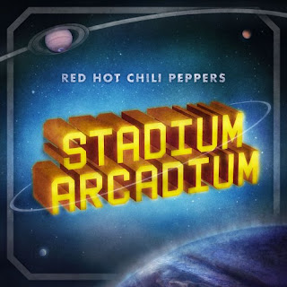
The digipak i have chosen to deconstruct is Red Hot Chili Peppers - Stadium Arcadium.
Front Cover:
Left Opening Page:
Right Page:
Back Cover :

Front Cover:
Left Opening Page:
Right Page:
Back Cover :
Genre:
- The Genre of this artist i think is rather evident from this digipak. The Red Hot Chili Peppers also come under the alternative rock/ pop music. The outer space feel and quite 'cooky' looking front cover is something typical and iconic for RHCP as thats what theyre style of music is. The thought of outer space and thes deep cosmic colours may bring across a dreamy other world feel to it and sometimes this is conveyed in their songs as they are something very different too which adds to their meta-narrative.
Media Language:
- As i've previously mentioned the tone and colour of this digipak brings across quite a mystic and mellow feel something which i think the band can comply with image wise. The shot of the band on the back cover comes from a lower angle close up of only their faces lighted a bit and comes across as quite a stylistic look and mysterious also. The connotations of the bright coloured feathers and facial expressions are of a fun one and theyre messing about which is something i feel the band enjoys doing as much as their music something which audience may be able to relate to creating para social intimacy.
- The meaning genrated through these images is of their style of music and in general their attitudes to what they do, which is fun yet different something against the status quo of most alternative bands.
- The use of 'Stadium Arcadium' as their album title creates quite an american feel to it which i think the band are quite relatable to furthermore the use of coinage such as 'Arcadium' gives the bands title a more personal and iconic feel for the audience.
- The use of relatively undiscovered planets as said creates a mysterious feel to it which many people may relate to when they see this and something thats different.
Representation:
- The overall weirdness and mystery these images generate help reinforce RHCP meta narrative of being exactly like this and something no one has ever heard before or since them being completely unique in their musical abilities. Something that is unknown as well may connote what the music on this album is like compared to previous albums maybe.
- This continuing theme of mystery is something also very relatable to Dyer's theory which suggests how this mystery and enigma makes the consumer strive to consume more.
Intitution and Audience:
- I think this print text will be consumed on a large scale as RHCP are popular and liked by almost everyone no matter what music they most like. The digipak itself may be a collectable also being a band as popular as RHCP even some of their old stuff is considered to be infamous and timeless. Therefore the overall aesthetically pleasing features of this digipack will help the audience to engage and consume easily.
Group - Proposal Audience Research
- What style is your audience research going to take? (What you did last time)
- What is the purpose of audience research?
- Who are your target audience and who are you going to contact them?
Our target audience for the video are young people between the ages of 12 and 40. We will access these people through social networking sites such as Facebook where we can post links to the survey which will have been created on Survey Monkey.
- What are examples of possible questions?
Do you think perfromance shots of the band are needed?
What do you think the mood of the song is?
During the performance shots, how do you think the lead singer should be dressed?
These are some possible questions we would do.
George - Deconstruction of an Album Advert
The bands album poster i have chosen to deconstruct is Alter Bridge which fall under the rock/ alternative rock genre.

Genre :
- I think that the genre of this type of music is evident from the poster. The use small flames at the botton of the poster may be something you associate with rock as it may be in your face and come across as almost devilish in connotation. Furthermore the text they have used for the A and E reinforces what type of genre this is, with them both looking almost tattoo like which you may connote with rock stars all covered in them. Going back to the more satanic theme and look the wings they have used on the A and B badge look very demonic which you can also associate with this genre. The old weathered look of the page and background may also convey this type of genre as something aged and classic look as though it holds some sort of material significance.
Media Language:
- The reading lines in this particular poster is very straight forwards and attracts you to the top and then going down until you eventually look at the album and then aesthetics such as swirls and flames. The colour of the overall piece is relatively dull with blacks and creams for the majority which creates a stylish look, with the exception of the logo standing out in red something which they may want people to note and remember thats iconic. As for the symbols like i said earlier the wings give it that demonic effect commonly associated with rock but also as it's in the form of a crest this also gives it a classical and more distinguished look showing how the band is serious about what they do and want to create an image and meta narrative for themselves.
- As the album title is of the band it doesnt hold many connotations apart from the fact this may mean they are quite popular and people will easily recognise their name. The words "14 amazing tracks" obviously show the posters marketing purpose by using words such as amazing will hopefully generate more consumers to buy.
- The reference to popular culture in this poster may be that it is associated with these devilish and demonic connotations which many bands like this often are in relation to image. Furthermore the tone and mood of the poster being quite serious and dark yet stylish is something also used by others of similar style.
Representation:
- As previously mentioned with the tone, images used, text font, background and along with the actual album cover looking rather celtic and ancient this definitely adds to the bands image of a typical rock band. This steady portrayal of who they are helps them to sell as people will be comfortable and used to their style and with this new poster reinforcing the same ideas people will expect nothing less than what theyve heard before or better. Moreover as it holds some typical characteristics of rock it may encourage more people who like similar music to invest in the album. However there will also be an element of Dyer's theory in the poster where an enigma is created about the band which makes the consumer strive to consume more which is what the bands main goal would be.
Istitution and audience:
- As with all poster adverts this text could be consumed in many ways. For example in a magazine or newspaper most likely in a magazine such as 'Kerrang!' as it is a rock magazine and will have other such bands. Another way this could be advertised is on billboards around areas where they may perform or that type of music is popular or even on bus stops. However in order to be consumed it has to insight interest and as the line of reading starts of with the bands name people glancing at the advertisement will either read on in curiosity or knowledge of this band which will help to generate consumers. However as the poster conveys such strong connotations and images it is most likely to attract the attention of someone who likes this type of music.
Tuesday, 5 October 2010
James - Deconstruction of Digipak
Brendan James is a singer/song-writer from America. His music is similar to The Scripts, who are also in the pop-rock genre. I am deconstructing the digipak of his debut album ‘The Day Is Brave‘ which was released in 2008.
Digipak Cover

Digipak Back Cover

Digipak Booklet

Genre
There are several different aspects of this digipak that enable the audience to see what genre the artist belongs to. The front cover has quite a masculine feel as the dominant colours are grey and brown. The location of the digipak cover is also masculine as it has been shot in what looks to be a dusty room with the star sitting on the floor with his back to camera. This location also gives a feel to the kind of artist that Brendan James is. It is very common for authentic singer/song-writers to have a lowfi image on the front of their albums, for example Bob Dylan’s 1963 album The Freewheelin‘ has a similar feel to it as can be seen below:

The costume that Brendan James is wearing is again indicative of the genre of music that he creates. He is wearing a very simple coat and pair of genes which reinforces the conventions of this genre. The conventions of the singer/song-writer genre are very different to the conventions of other genres such as ‘pop’ music. The conventions of a pop music digipak are that there is a very clear image of the star and the ‘star motif’, a good example of this is Lady Gaga’s album ‘The Fame’ which is simply an image of her face in a very out of the ordinary costume which is designed to stand out of the crowd. The artist’s name is also displayed in a very clear font so that it is as easy as possible for the audience to recognize who’s album they are looking at. The album cover is shown below:

Media Language
Various visual techniques have been used to construct this digipak. The first being the use of the rule of thirds to create the front cover photograph. The star is positioned slightly to the left of the space which means that the image looks very natural.
There are several different textural effects that have been applied to the photo is post-production. The first is the ‘eroded’ effect that has been used around the edge of the photo, this creates the illusion that the photo is old and has been worn around the edges. The second effect that has been applied is the ‘grainy’ effect. This is where the photo looks faded in certain areas and this has again been used to create the effect of the photo looking old. The same two effects are applied throughout the digipak and also to the promotional poster.
The mise-en-scene of the front cover also helps to construct a certain image about the artist and his music. The stars bond language is very mellow and emotional, I think that this is reflected by his music as his songs are also very melodic and relaxing. The lighting in the photos on the front and back covers of the digipak are ambient and not directed onto anything specific, this gives the shots a natural feel.
The front and back covers of the digipak both feature cream colored bits of wood laid on the floor, with smaller black bits of wood laid on top of them. These objects connote a piano and its keys, however the way they are laid out connote that the piano has been broken. I think that this suggests that Brendan James is trying to create something different within the music in his album. The post-production affects applied, the costume and the location also connote that the singer has created a simple album which is filled with emotion and passion.
The title of this album is ‘The Day Is Brave‘ and I think that the image of the star does evoke the feeling of bravery when tied in with this title. This linguistic device helps the audience to imagine the process that Brendan James has gone through when creating the album. I think that the title and the connotation of the smashed up keyboard could be interpreted as Brendan James having had problems in his life which has meant that creating music has become harder for him and that it is only now he has managed to again.
Representation
The digipak creates the image that Brendan James is a very respectable artist who has true musical talent. This representation is created by the front and back cover which is not overly bold or flashy, the images and text portray him as a simple singer/song-writer who is able to play his own instruments and create his own songs. I think that this digipak will help add to Brendan James’ meta-narrative because his production company will constantly try to sell him as a singer/song-writer and these images will help to cement this idea in the minds of the audience.
Institution and Audience
This print text will be consumed in a focused way. When on display in a shop the customer is likely to spot the digipak because of its contrasting white border and dark image. They will then take a closer look and consume all of the information on display by the media text. The front cover image is put together in such a way that the viewer will first be drawn to the artists face and then look up to see the artists name and the title of the album, finally they will look to the bottom of the image and see the location of the star. This process of creating the path for the audience to look at the media text along is called creating a ‘leading line’.
Subscribe to:
Comments (Atom)